

Colour is about so much more than “colour” in the simple sense of the word. After all, with only three primary colours, red, blue and yellow, how can our world be so colourfully rich? Workplace design and fit-out company Evoke Projects explores the many aspects of colour and the trends for 2024.
If colour was simple, we wouldn’t see many changes in colour trends. However, a little wander through the paint aisle at the local hardware store shows us that there are hundreds of varieties of ‘white’, ‘blue’ and every other colour. Colour also depends on individual interpretations, with one person’s ‘brown’ being another person’s ‘taupe’ and yet another person’s ‘grey’! Who hasn’t had that argument?!
Hue, brightness, saturation, tint, shade and tone contribute to the many varieties of colour. Light is also a major influencer with colours viewed in natural daylight, sunlight, shadow, warm light and cool light looking very different. And let’s not get started on digital vs printed vs manufactured colours. We all know someone who ordered a dress, house repaint or even a car based on a picture and lived to regret it!
Inspiration for colour trends in workplace design will often start with fashion and interior design trends.
The Pantone® Color Institute reports on trends from London Fashion Week, describing 2024 colour trends as “an eclectic mix of vivid brights with rich nature based tones”.
Link to https://www.pantone.com/articles/fashion-color-trend-report/london-fashion-week-spring-2024#
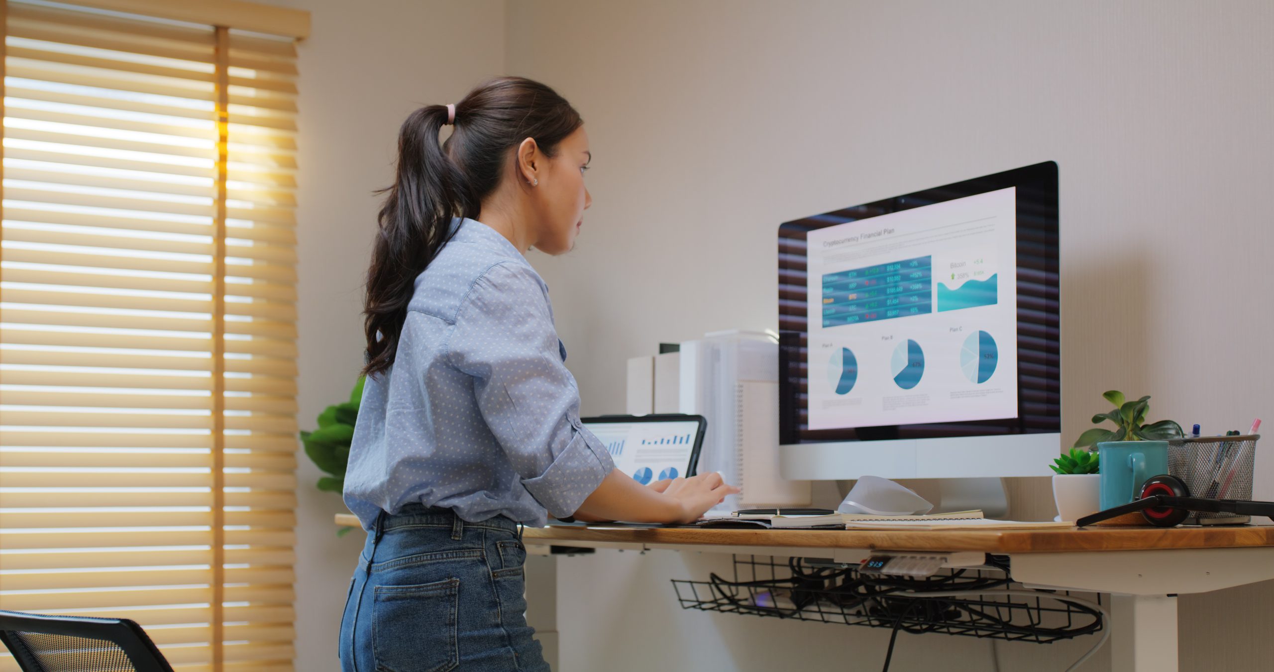
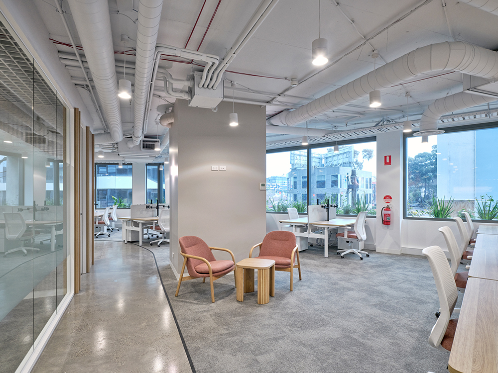
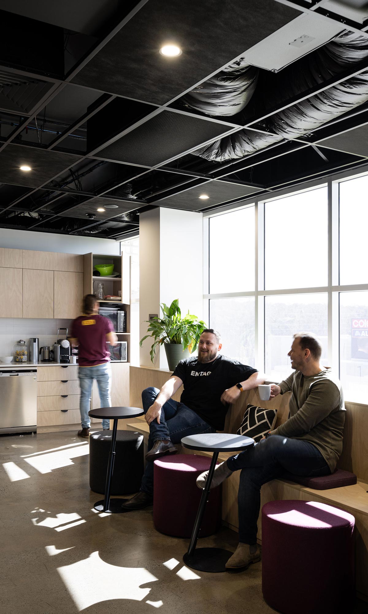
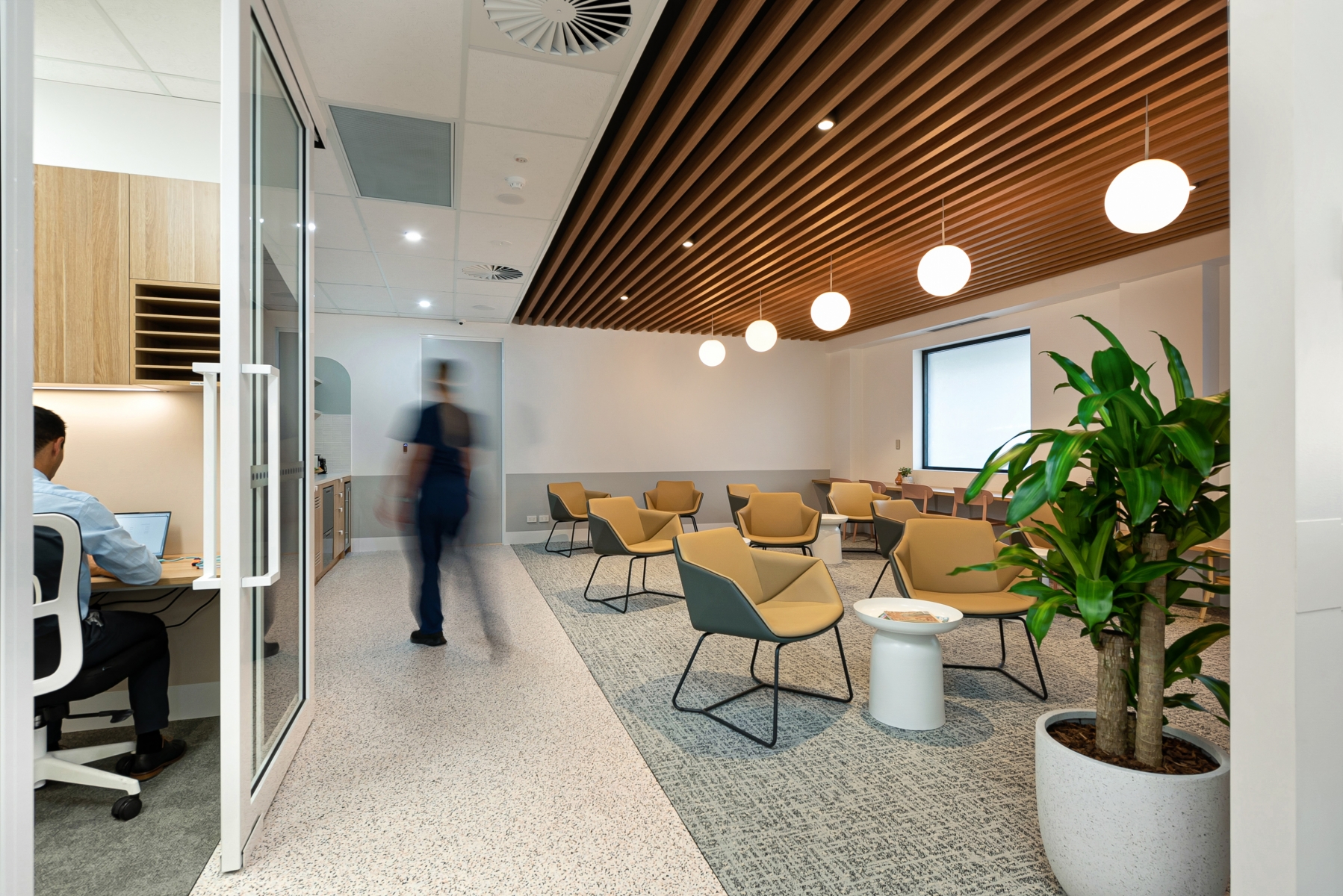
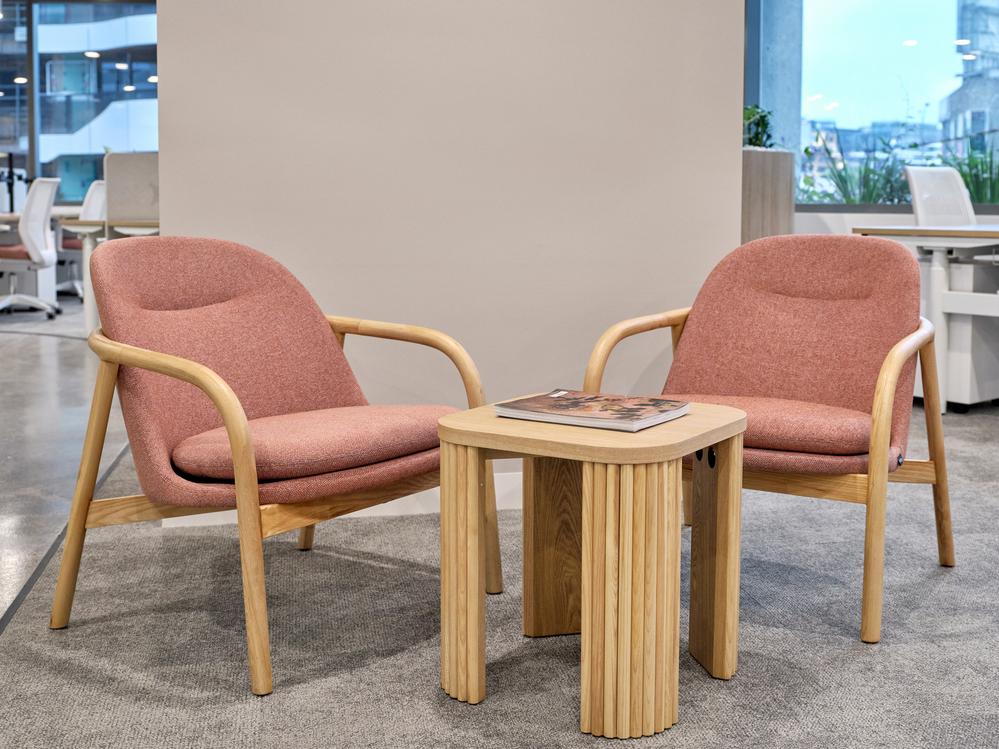
Biophilic design colours, such as blue, green and brown, are considered for most modern office fit-out designs because the benefits of natural colours to workplace well-being are well documented. For 2024, we can expect to see bold, accent splashes offset with these nature-invoking colours. Feature walls, geometric patterns and sustainable materials will give scope for extra creativity in commercial interior design.
Dulux is forecasting 2024 colour trends in three palettes: Solstice, Muse and Journey.
• Solstice is influenced by Scandinavian design, Mediterranean and desert landscapes. The warm colours with cooler accents are soothing, nurturing and joyful. Tactile décor such as braided textiles and primitive sculptural forms add sensory delight to this theme.
• Journey celebrates global influences with an eclectic palette of rich reds and plums, yellow-greens and mid-tone blues. Paired with furniture and fabrics that are heavily patterned and textured, the Journey palette honours memories and traditions. Modern meets past with sustainable décor and recycled items.
• Muse has a strong ‘70s influence with modern twists. It is colourful with warm browns, cool blues and timeless greens. Fun and relaxed, Muse works well with velvet upholstery, chrome detailing, dramatic décor and glossy surfaces.
The Muse colour palette offers up the “bold rich tan and russet brown colours of Fantan and Guitar” in a distinctly modern nod to 1970s Mission Brown, showing that everything old really is new again!
Link to https://www.dulux.com.au/colour/colour-trends/2024/
In addition to the usual fashion and interior design colour trends, we will see more focus on homely colours. Companies are balancing the carrot and stick when trying to attract people back to the office. Those companies will look for more resimercial and homely office fit-outs supported by warm neutrals and softer versions of the ‘bold’ colours. Biophilic colours will tend towards the lighter, relaxing shades rather than vivid sky blue or sunshine yellow.
Greater autonomy is also likely with department heads customising spaces to suit the work zone. Creative departments will favour more reds, yellows and purples, while task areas will prefer colours that foster concentration, such as blues and greens.
To discuss colours for your next workplace design and fit-out, please call Evoke Projects on 1300 720 692.