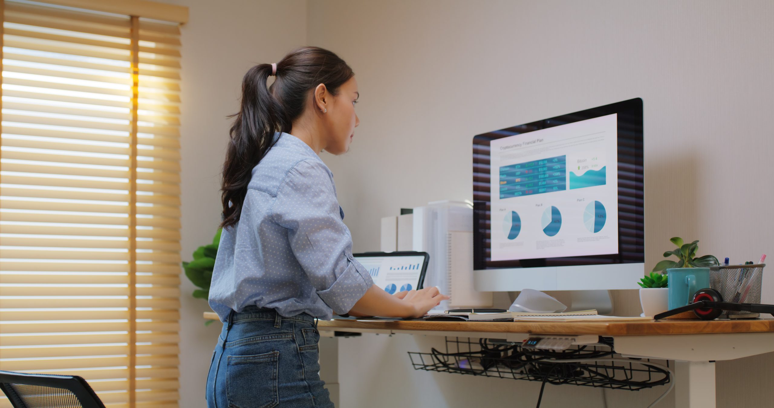


It may surprise you how much impact colour has on well-being in the workplace, influencing both mood and productivity. Workplace design company Evoke Projects looks at how colour affects well-being, with advice on using colour effectively within your office fit-out.
Colour is very powerful, with the potential to change the way we feel on any day in any space. There are even medically reviewed articles written about colour psychology. See e.g. How Colors Impact Moods, Feelings, and Behaviors by Kendra Cherry.1 She writes that certain colours have been associated with physiological changes, including increased blood pressure, increased metabolism and eyestrain.
Cherry also refers to the practice of “colorology” as a holistic or alternative treatment.2
• Red is used to stimulate the body and mind and to increase circulation.
• Yellow is thought to stimulate the nerves and purify the body.
• Orange is used to heal the lungs and to increase energy levels.
• Blue is believed to soothe illnesses and treat pain.
• Indigo shades are thought to alleviate skin problems.
Colours have associated moods, but it’s important to add a contextual background. For example, cultural differences, brand association, personal preferences, lighting and fashion may all impact somebody’s reaction to a colour within the office design. It’s important to know your audience when designing with colour.
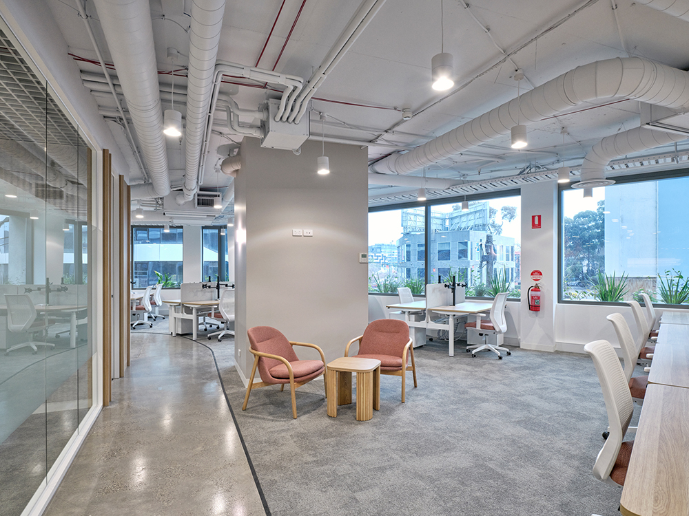
In general, bright colours lift the mood, while neutrals are calming and relaxing. Nature-inspired colours, such as blues, greens and browns, evoke feelings of well-being and tranquility.
• Red and Orange: Warm, exciting, attention grabbing, but can be overwhelming.
• Blue: Calming, relaxing, trust, natural, aids concentration, but can be cold.
• Yellow: Energetic, happy, stimulating, collaborative, but can be tiring.
• Green: Natural, balance, calming, good for focus and well-being.
• Brown: Reliability, stability, natural.
• Purple: Luxury, creativity, elegance.
• White: Simple, clean but can be cold.
• Black: Sophisticated, formal, but can be depressing.
• Neutrals: Calming, minimalist, relaxing.
Tones (e.g. warmer or lighter tones) will reduce the negative impact of a colour. Colours that evoke strong emotions can be used as an accent colour rather than on whole walls.
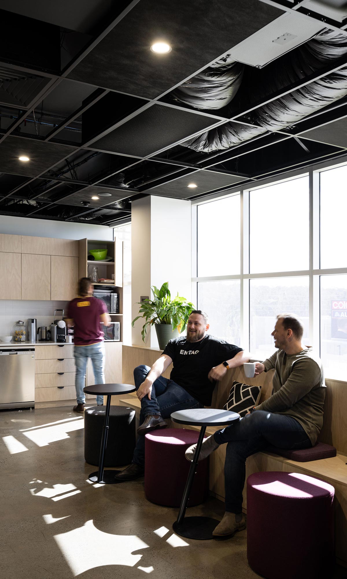
Within activity based work zones, use colour throughout your office fit-out to suit the activity. If people feel that the colour around them suits what they are trying to achieve, they will feel more positive. Their well-being in the workplace will be enhanced.
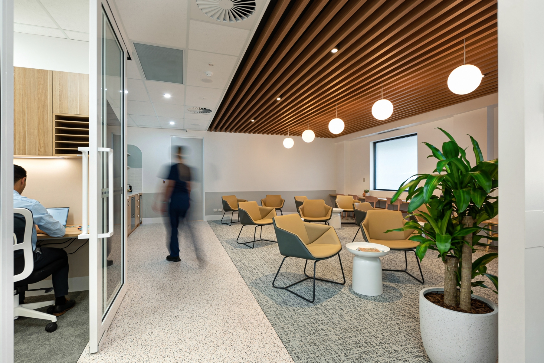
Brighter colours will suit breakout zones, while muted colours are better in focused work areas. Corporate brand colours promote a sense of teamwork and identity to boost productivity.
Let’s not forget Mother Nature’s own colour – natural light. Natural light influences the perception of any colour, warming with sunlight rays and lighting up a drab interior. Natural light also regulates circadian rhythms, improving sleep quality and overall health.
Natural light is an important component of biophilic design. Biophilia means “love of living things”, and biophilic elements in the office design promote wellness and boost mental health. Nature-inspired colours, such as blue, green and brown, are on the biophilic colour spectrum and influence the subconscious mind with their link to sea, sky, plants, trees and earth.
Lighting affects colour ‘temperature’ depending on the Kelvin (K) rating of a light globe or device. The lower the K, the warmer the tone.
• Soft White (2700K-3000K) is cosy, with warm, yellow tones.
• Warm White (3000-4000K) is warm and welcoming.
• Bright White (4000-5000K) is a bright, neutral white.
• Daylight (5000K-6500K) has cool, blue white tones.
Work spaces will benefit from 3500-4500K lighting (or higher for close task areas where bright light is needed), while breakout zones will be more welcoming with warm white.
There is so much more potential for using colour within your office fit-out than just the walls. Ceiling tiles, screen dividers, stair rails, door handles, office furniture, lounge style furniture, rugs, cushions, ottomans, artwork, plants, light fittings… Even if you choose a primarily neutral colour in one zone, a pop of a brighter colour will provide visual stimulation without overwhelming a space.
To discuss the best use of colour within your workplace design and fit-out, please call Evoke Projects on 1300 720 692.